
Identity Research Lab’s work was spread across emails, PDFs, and Google Docs. I designed a website to bring it together so people could see what the lab was working on and find the research behind it.
Problem
Dr. Jess needed a way to show the full scope of the lab’s work without sending people through separate files and conversations.
Outcome
I built a working prototype and handed over the site map, content map, components, and accessibility spec for a production build.
Role
Product Designer
Research, IA, visual design, prototype build
Timeline
20 weeks
Team
- Cornelious Williams
- Dr. Jess Westbrook
- Coraline
Prototype
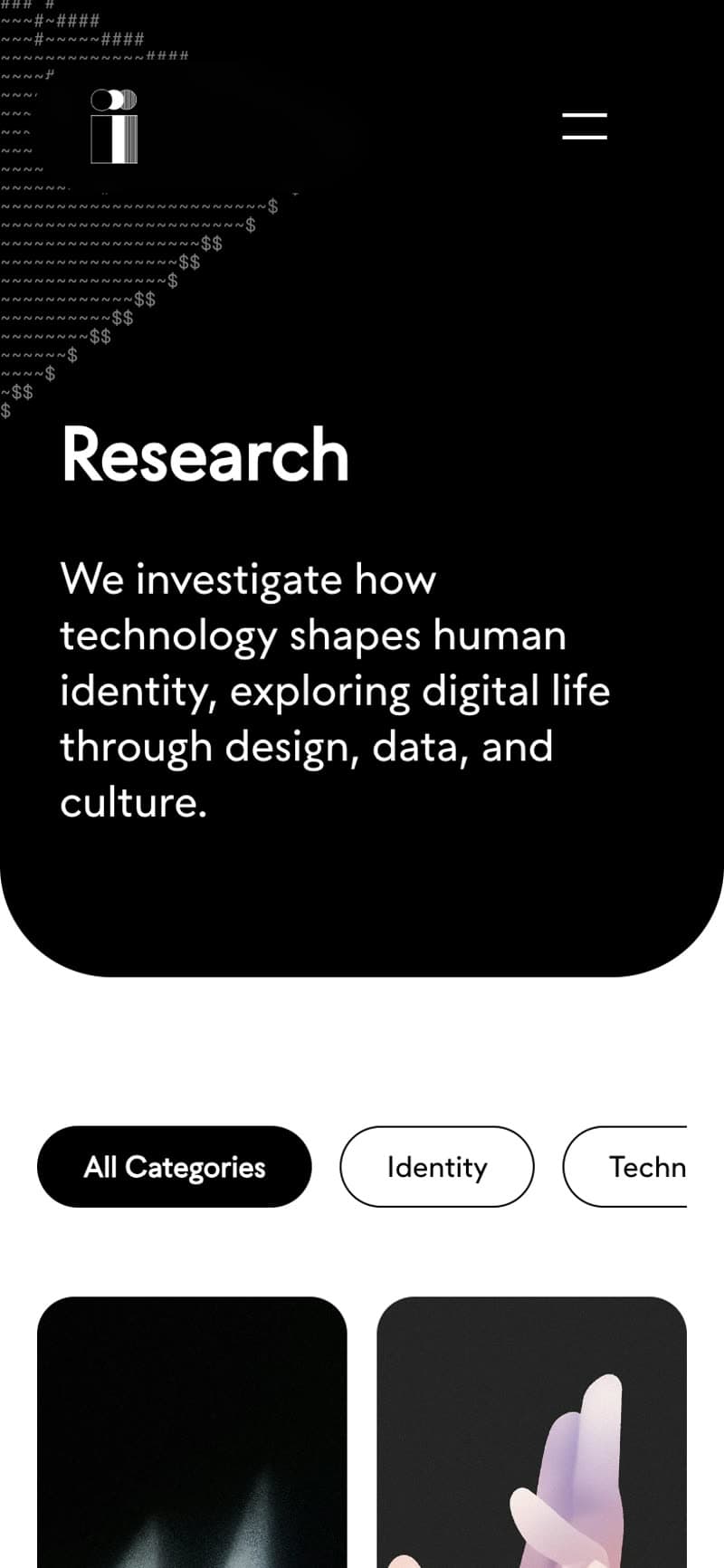
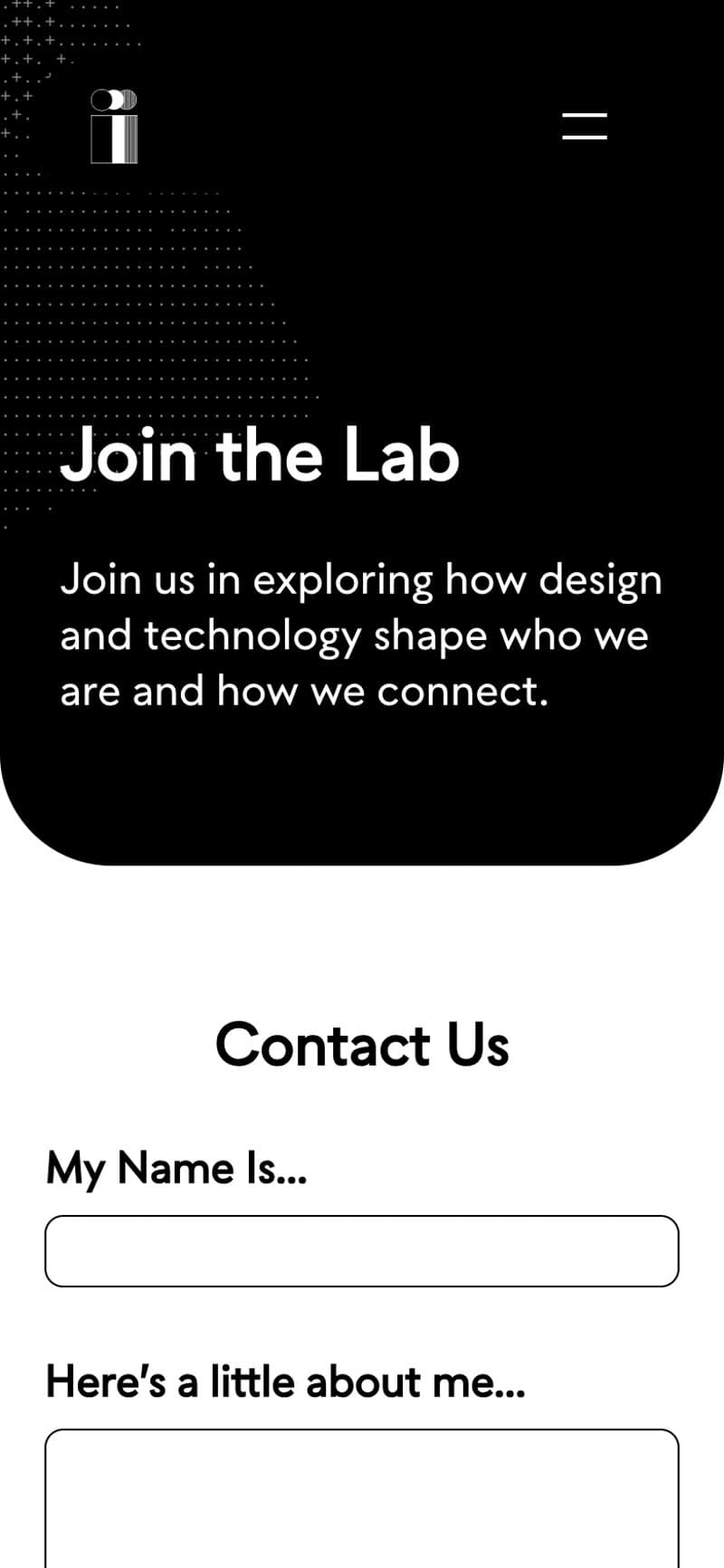
View the prototype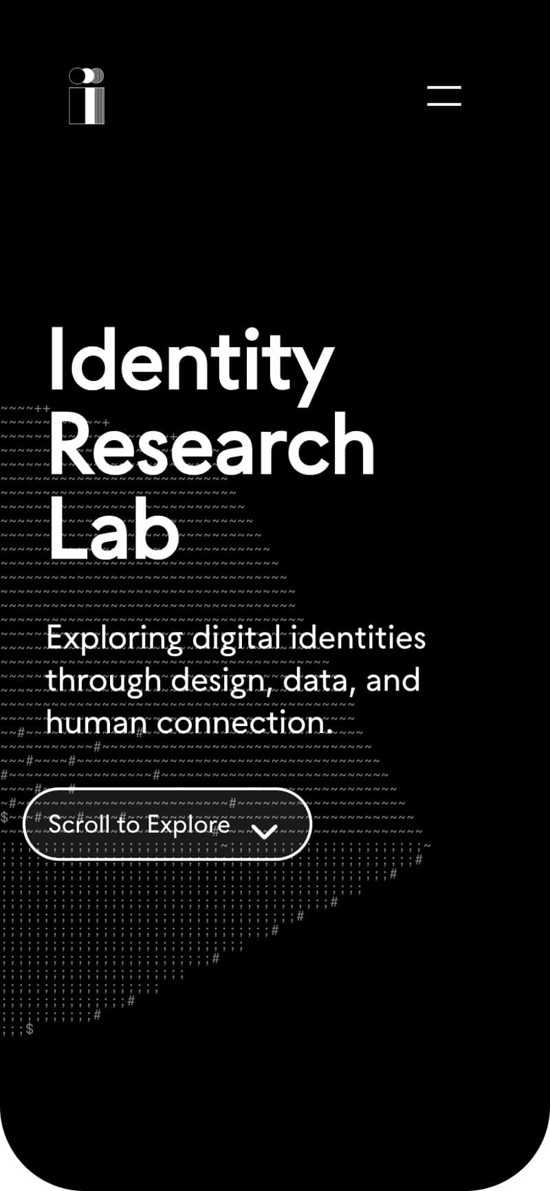
The goal
Give people one place to explore the lab’s research and see how the projects connect.
Research and discovery
The first ten weeks focused on who the site needed to serve: students, faculty, potential collaborators, and people coming across the lab for the first time. The research needed to make sense to someone who wasn’t already familiar with the work.
01Research & Design
I talked with Dr. Jess about what the lab needed to show, went through how other university research labs organize their sites, and sat in on one of the lab’s workshops.
02Structure & Early Design
I mapped the pages and what needed to go on each one, then worked through the first screens in Figma. I focused on type, spacing, and contrast, with components the lab could reuse as more research was added.
03Prototype + Handoff
I built a working prototype from the Figma designs so the lab could click through the site. The handoff included the designs, components, and an accessibility spec for the production build.
Design constraint
The site was meant to be open to everyone. I used WCAG requirements to guide decisions about readability, contrast, and interaction from the start.
Organizing the research
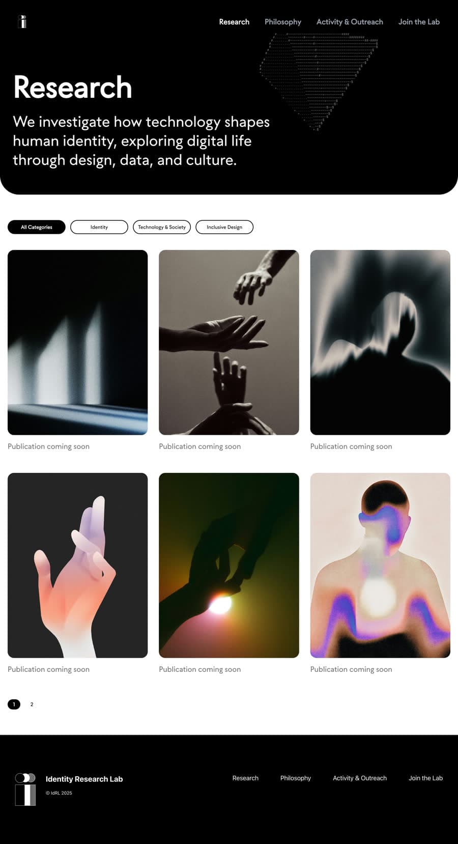
The Research section brings the work together. The site map shows where it sits alongside the rest of the lab’s content.
Before
Dr. Jess’s research was spread across PDFs, Google Docs, and other files. There wasn’t one place to browse it all.
Photo illustrating the idea of scattered research.
After
In the prototype, visitors can browse the Research page by topic and open individual pieces from one place.
Research categorization
The first version grouped research into current projects, publications, resources, and news. That tells you the format, not the subject. We regrouped it by theme: identity, technology and society, and inclusive design. Dr. Jess wanted it to read more like a blog, so clicking a piece either opens their newsletter or keeps you on the site.
Navigation decisions
We gave People, Research, Philosophy, Activity and Outreach, and Join the Lab their own sections. The site map laid out where the content belonged before I worked on the screens.
Planning the homepage
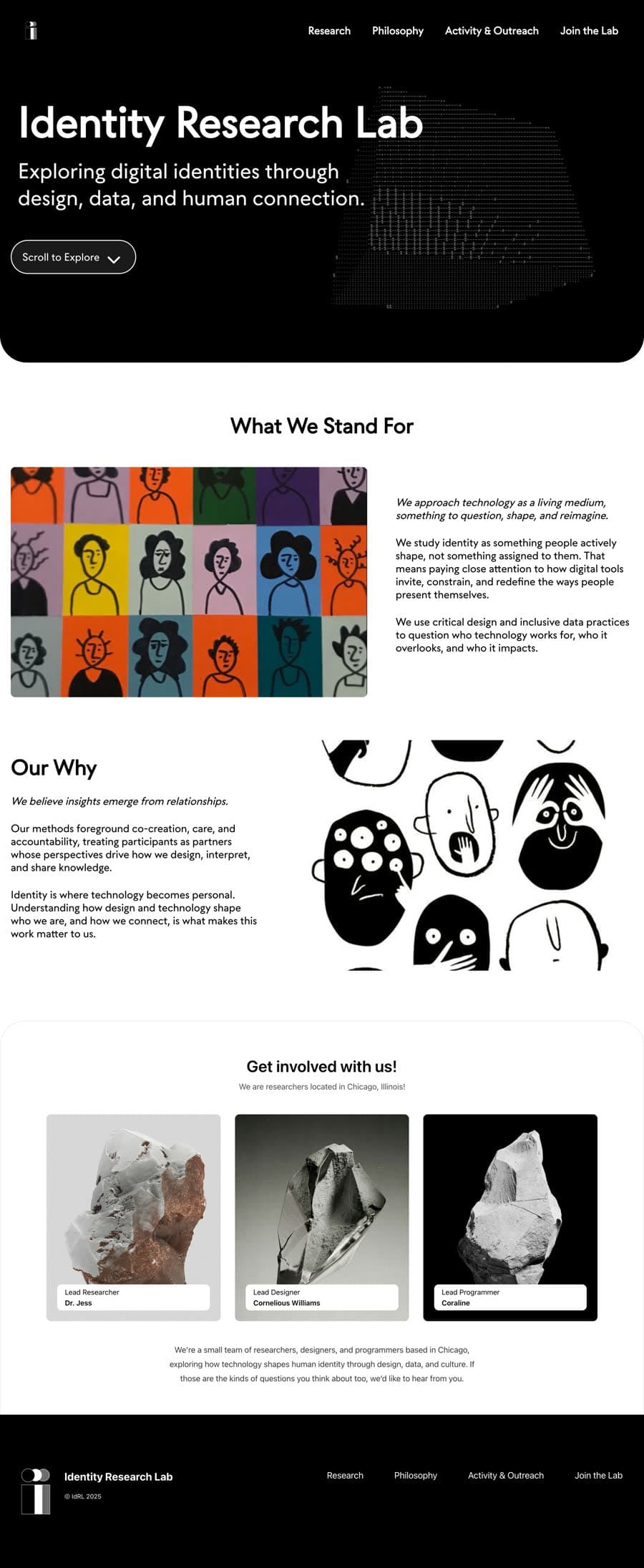
The homepage introduces the lab, highlights its work, and points visitors toward the research and the people behind it. The content map set that order before I worked on the page design.
Interaction + UX decisions
Once the pages were mapped out, I worked through what each one needed. A few sections came out, and the path from browsing research to opening a piece stayed the priority.
What we cut
A “Trusted by many” section came out. The lab was new and there wasn’t a list of names to back it up.
Keeping controls clear
Links and buttons needed to be easy to spot, with visible hover, focus, and active states. I kept motion subtle so it wouldn’t get in the way of reading.
Wireframes to high fidelity
The wireframes and the final screens are pretty close. Most of the changes came from removing things. Every page originally ended with a Contact us block. I took it off Research so the page could stay focused on the publications, and shortened the header.
User flow
I planned around two reasons to visit: exploring Dr. Jess’s workshops, demos, and publications, or getting in touch with the lab. Research came first: land on the site, see what’s current, and open a piece. Contact and joining the lab had their own paths.
Visual & brand system
The site uses Seabirds for headings and Inter for body text, with a black, white, and light gray palette. I carried the same type styles and components across the pages.
Primary Typography
Seabirds
Thin, Regular, Bold
Secondary Typography
Inter
Regular, Medium, SemiBold, Bold
Why black and white
Dr. Jess asked for black and white. Earlier rounds had gradient headers on every page. Those came out.
Across the site
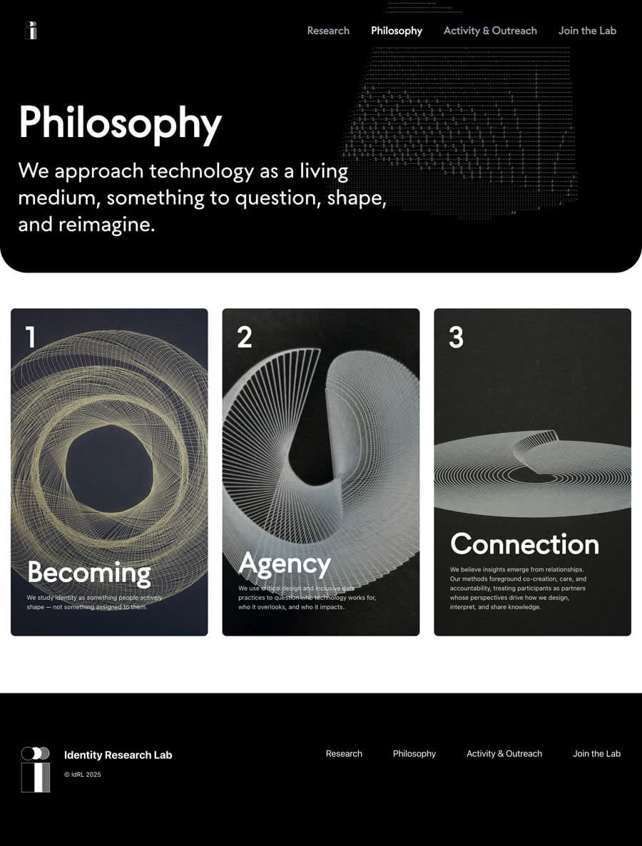
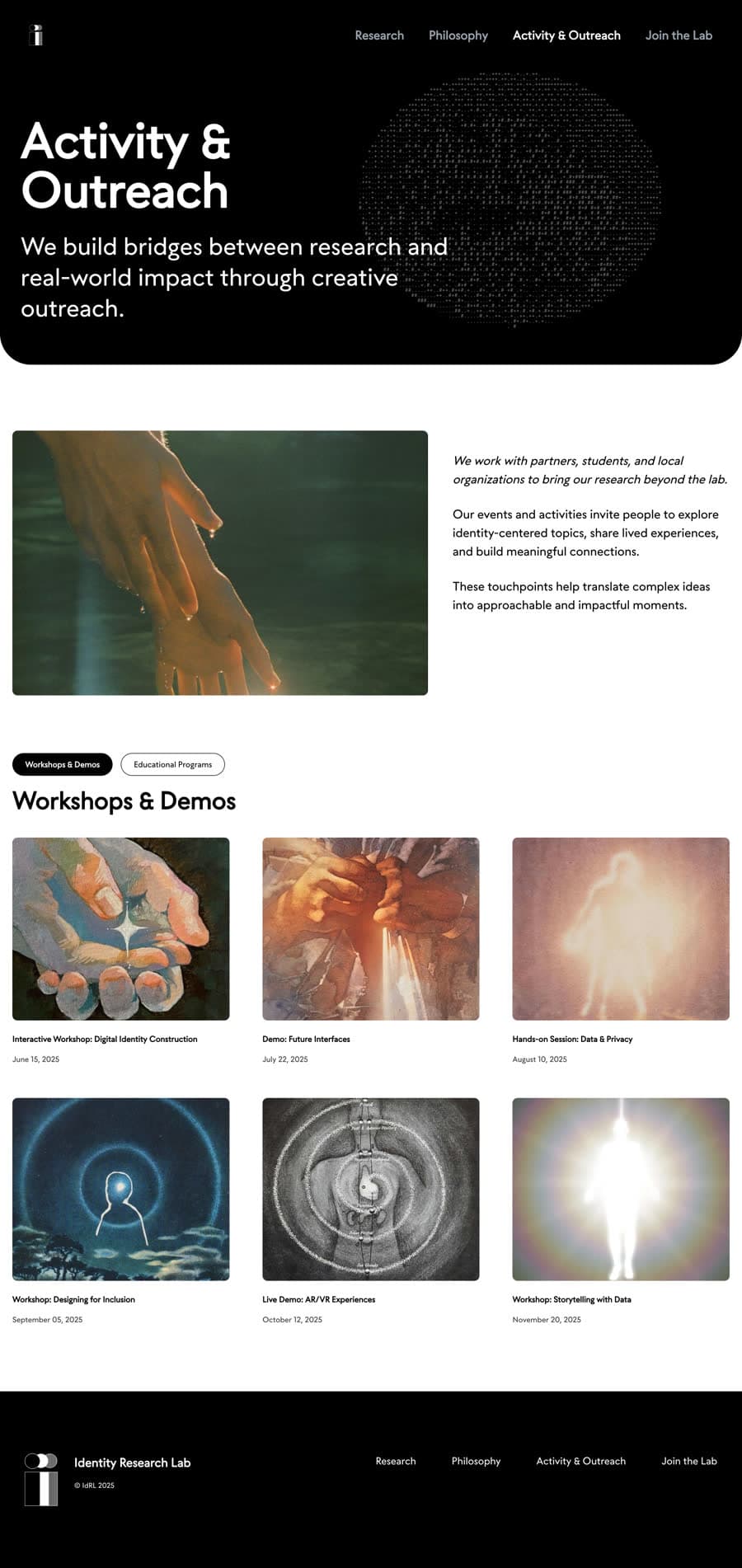
Where it stands
The prototype is live, and the design system has been handed over. The production site hasn’t been built yet.
What I’d check next
Once the production site is live, I’d check whether people can find a piece of research, open it, and access the material they came for. I’d also look at where they get stuck or have to backtrack.
Future iterations
As the lab adds more work, I’d revisit the filters, add more detail to publication listings, and link related projects.
Reflection
The decisions to cut things are what I’d carry into another project. The repeated contact blocks and the Trusted by many section were easy to include, but I couldn’t give a good reason to keep them. I’d ask that question earlier next time.