
Mobbin’s U.S. Finance app library
I led Mobbin’s U.S. Finance app library. I researched apps customers wanted to compare, chose the experiences to cover, and captured two apps a week.
- Role
- UX Content Specialist
UX Designer · MobLift - My scope
- Led U.S. Finance app library
Contributed to coverage priorities - Team
- Lynette Yap, Rick Lee, Natasha Tan, Jazzy Bui, and Corinne.Lynette led Finance+ overall.
Part of a 30-person team. - Tools
- Figma
 Mobbin
 Notion
 MobLift
Mobbin internal tool
Why Finance+ existed
Finance teams needed detailed competitive research on U.S. apps. Finance+ gave useful apps and flows a dedicated home when they weren’t a fit for Mobbin’s general inspiration library.
 Finance+
Customer requests
Lynette passed on most customer requests, and Rick shared some too. In Notion, I checked request counts to help prioritize apps.
Some apps I covered
More from my coverage
Wealthfront, Cash App, Public, Bright Money, Uphold, Fundrise, and Lemonade Insurance.
Choosing what to capture
I combined customer requests with apps I found on Design Twitter, in the App Store, and on blogs. I used the apps and unlocked access before choosing what to document.
Research apps
 Wealthfront
Requests in Notion helped set priorities. Design Twitter, the App Store, and blogs also led me to apps worth exploring.
Use the app
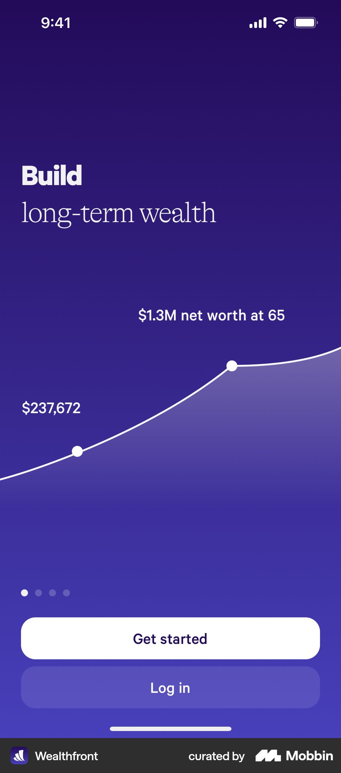
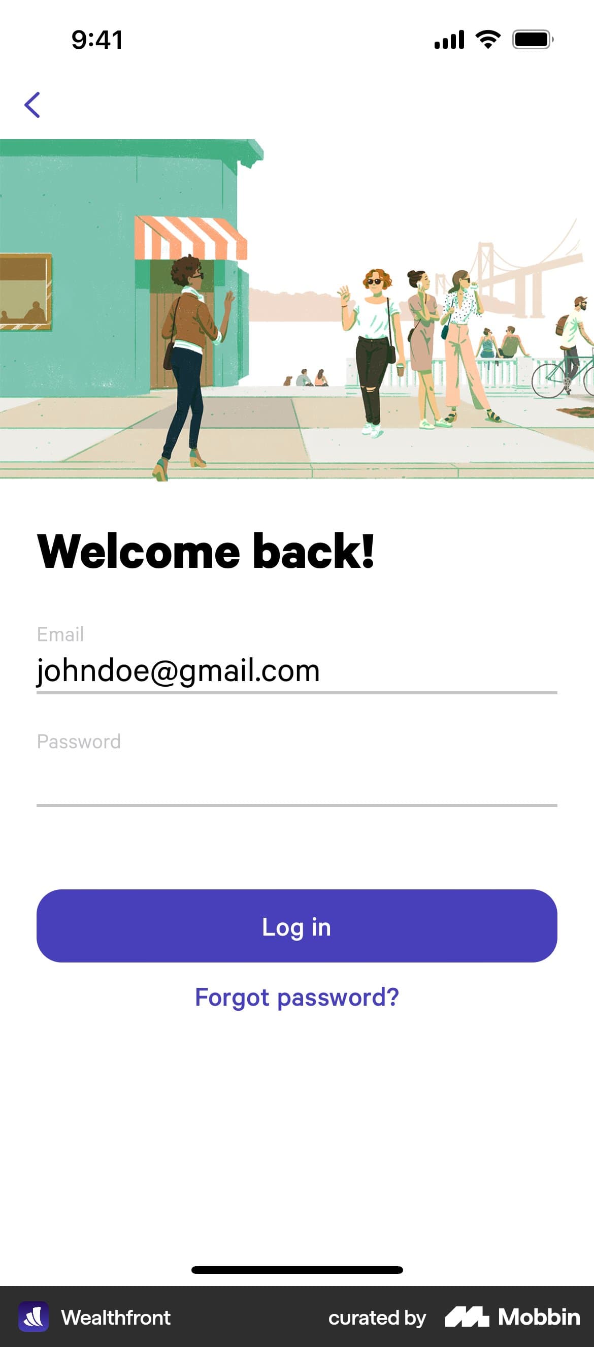
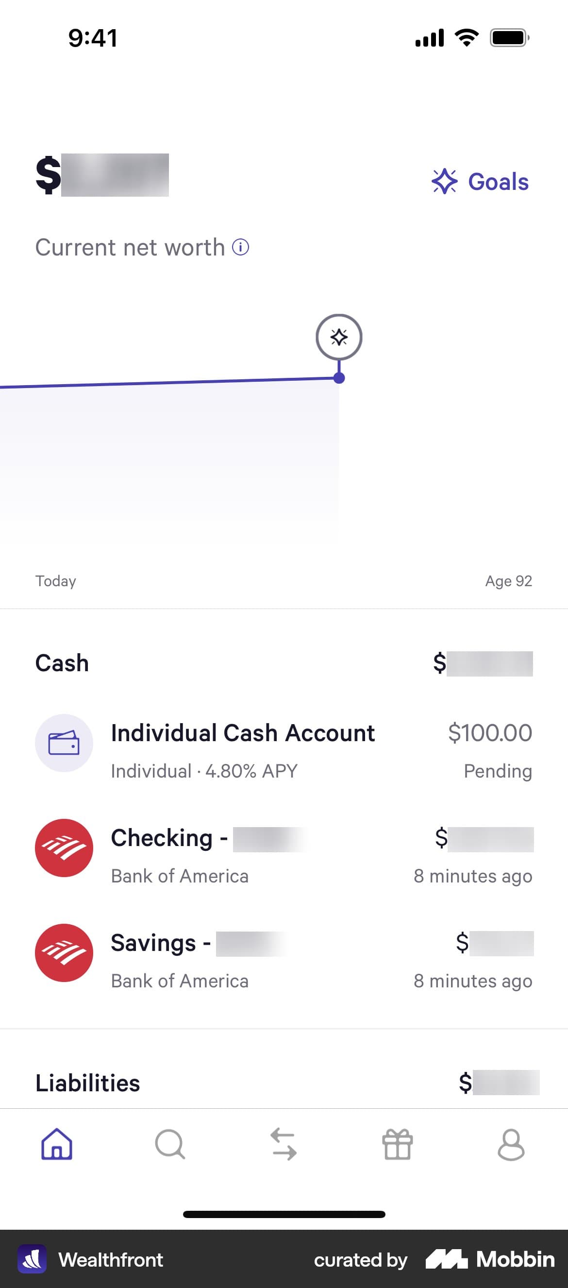
I used the app myself and unlocked access to its experiences. That meant following the steps, not judging it from a single screen.
Capture each step
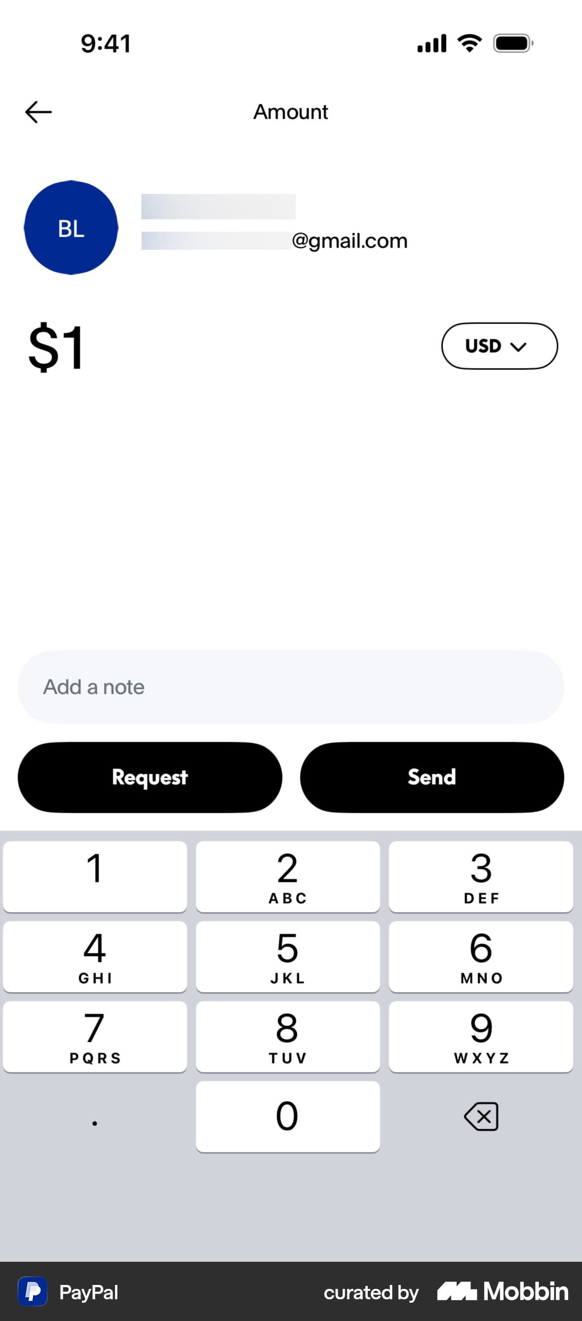
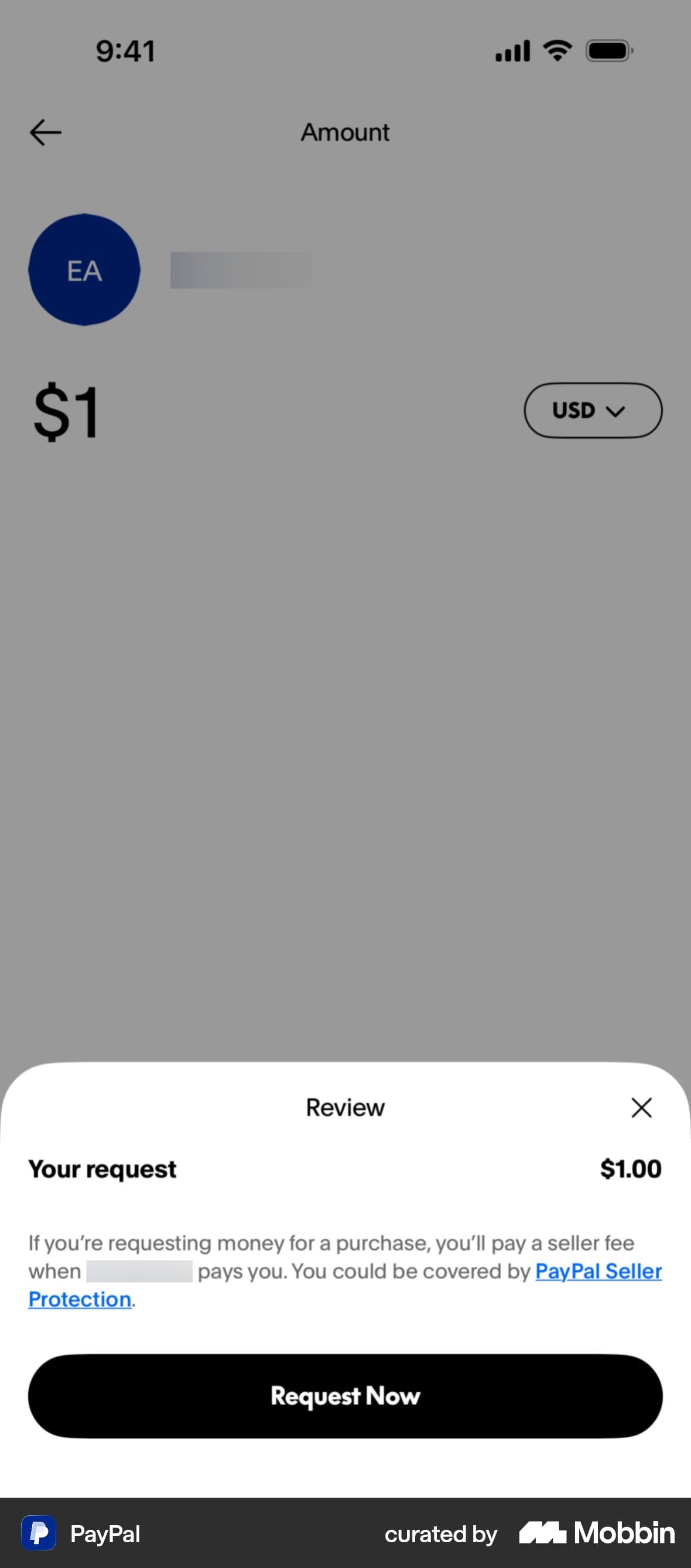
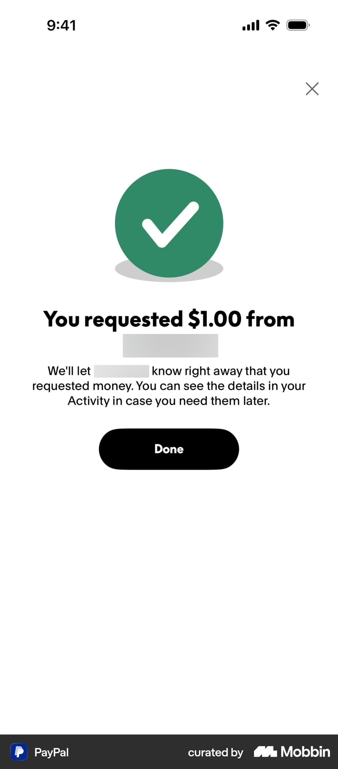
I captured the app’s experiences step by step so a flow was complete. I avoided duplicate screens and aimed to capture relevant UI elements on the first pass.
Organizing flows and labeling UI
I organized captures into flows and labeled the UI across each screen. Machine-learning and mapping tools helped with the annotations. I also annotated captures from freelancers and teammates.

Request money
Complete flowEvery step, every screen
The flow gives a researcher the complete sequence. UI labels make the elements within each screen searchable.
Request money
Tap through the flow, then inspect its UI.
Inspect a screen
Selected element
Amount, currency, note, actions, keyboard: I labeled the elements across the whole screen, then cleaned up the annotations.
 Open in Mobbin
PayPal: prioritizing crypto
PayPal had repetitive, outdated, and off-app screens. I focused on buying, selling, and sending crypto because I saw PayPal emphasizing those experiences.

PayPal
Buy crypto
Select a screen to inspect its UIElements on this screen
Enter amount
- Amount input
- One-time selector
- Rate disclosure
- Number pad
Open in MobbinWhat I left out
Currency exchange: I couldn’t complete buying one currency, converting it, and sending it. I excluded the broken flow.
What made the cut
Research value mattered alongside design quality. A useful competitor could be worth covering even when its UX was less exemplary.
Expanding requested coverage
The library grew around the competitors customers wanted to research. My contribution was the U.S. coverage: researching apps, choosing useful flows, publishing captures, and checking when they needed updating.
Next case study
MobLift
An internal tool I built because capturing apps was slow and cumbersome.