Sneaker Access
Sneaker Access is a dual-platform experience designed to make limited sneaker releases fair and transparent. Collectors constantly battle bots, inflated resale prices, and opaque drop systems that lock them out of the culture they love.
As the sole product designer, I led research, UX/UI, and branding to build a trust-driven commerce flow that simplifies release monitoring, authentication, and community insight. Early usability testing showed a 90% increase in task success and a 95% reduction in abandoned flows.
Problem
Sneaker enthusiasts struggle to access drops fairly. Bots and limited stock create an unfair system that leaves most users empty-handed and skeptical of brands. This frustration inspired the following challenge:
How might we make sneaker release experiences more accessible, transparent, and community-driven for collectors of all levels?
Outcome
The final solution delivered a unified platform for tracking drops, verifying authenticity, and joining fair-access releases. Prototype testing improved task completion by 90% and reduced drop-off rates by 95%, showing a measurable boost in user trust and clarity.
Role
Product designer
Research, UX/UI, and Branding
Timeline
Sep '19 - Jan '20
Team
- Connor O'Neil
- Andrew Evan
- Waseem
- Alex
Features and Iterations
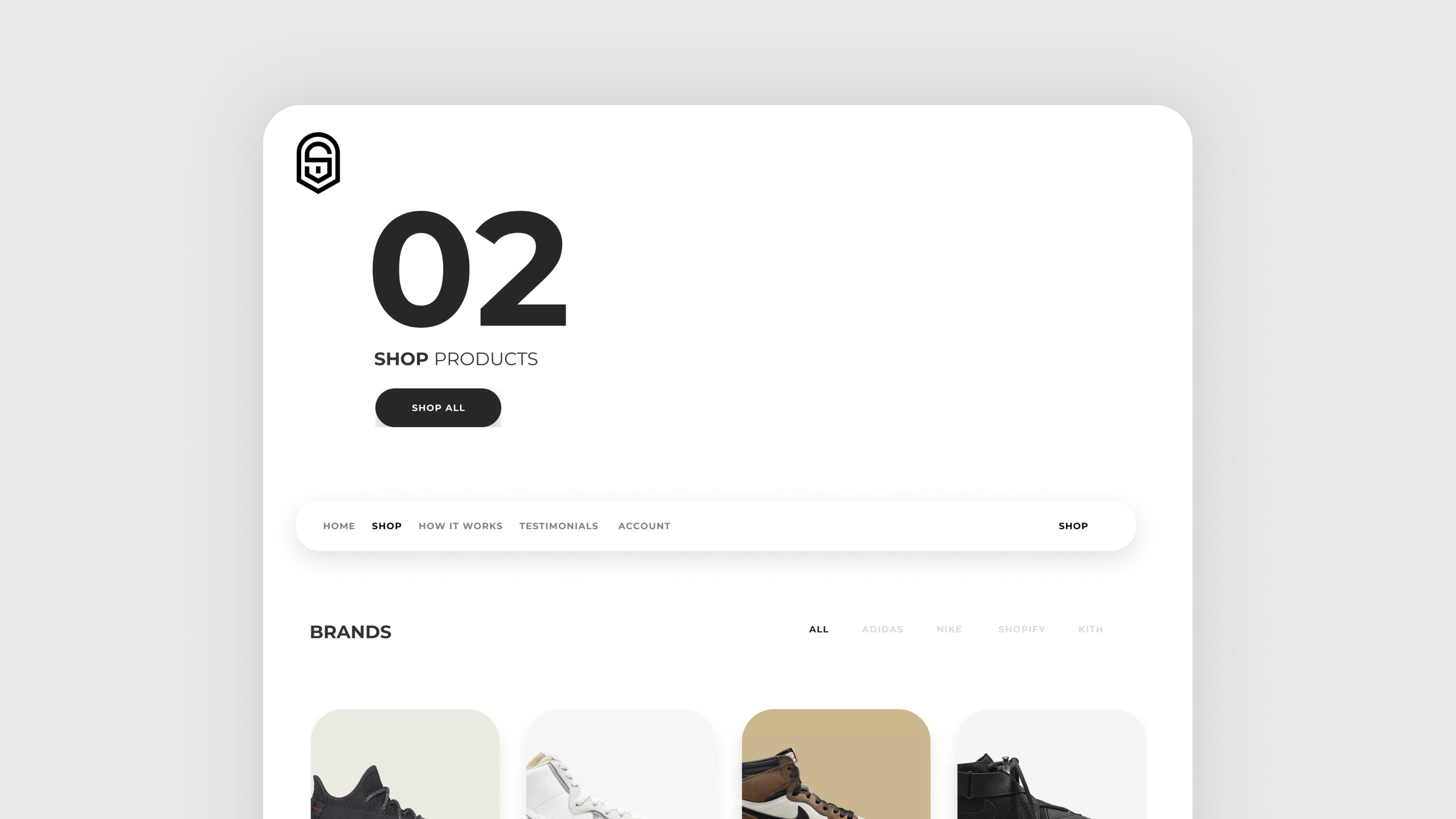
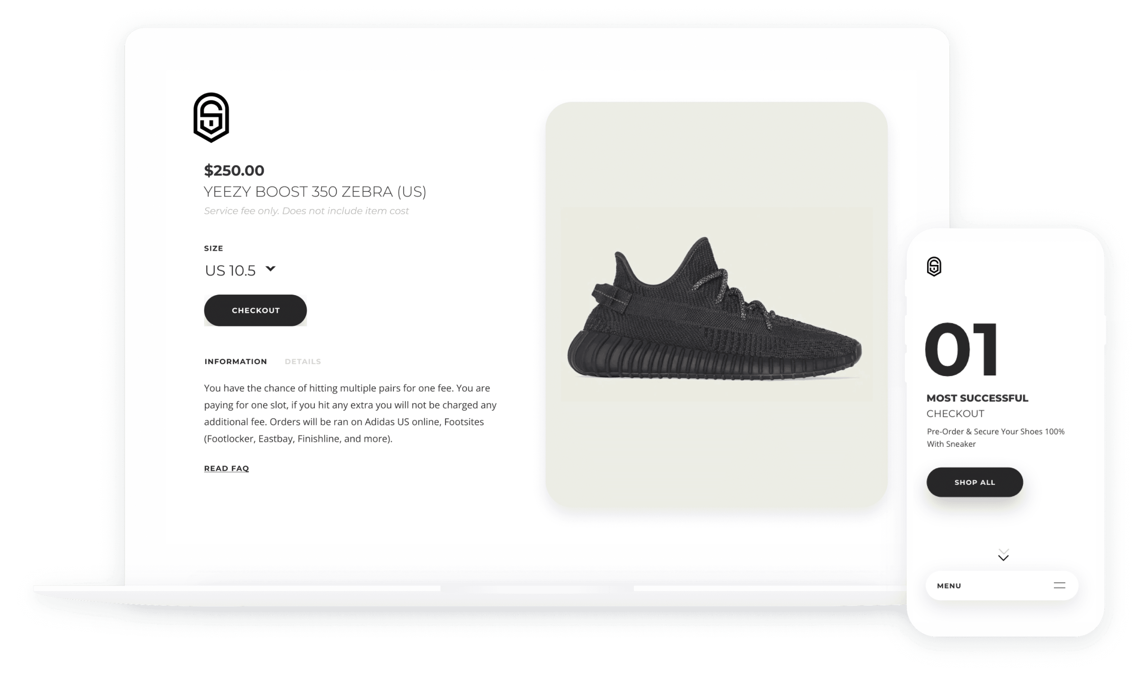
Shop
After creating your account, cycle through the pages to purchase a slot that could potentially give you the Supreme items you've been wanting.
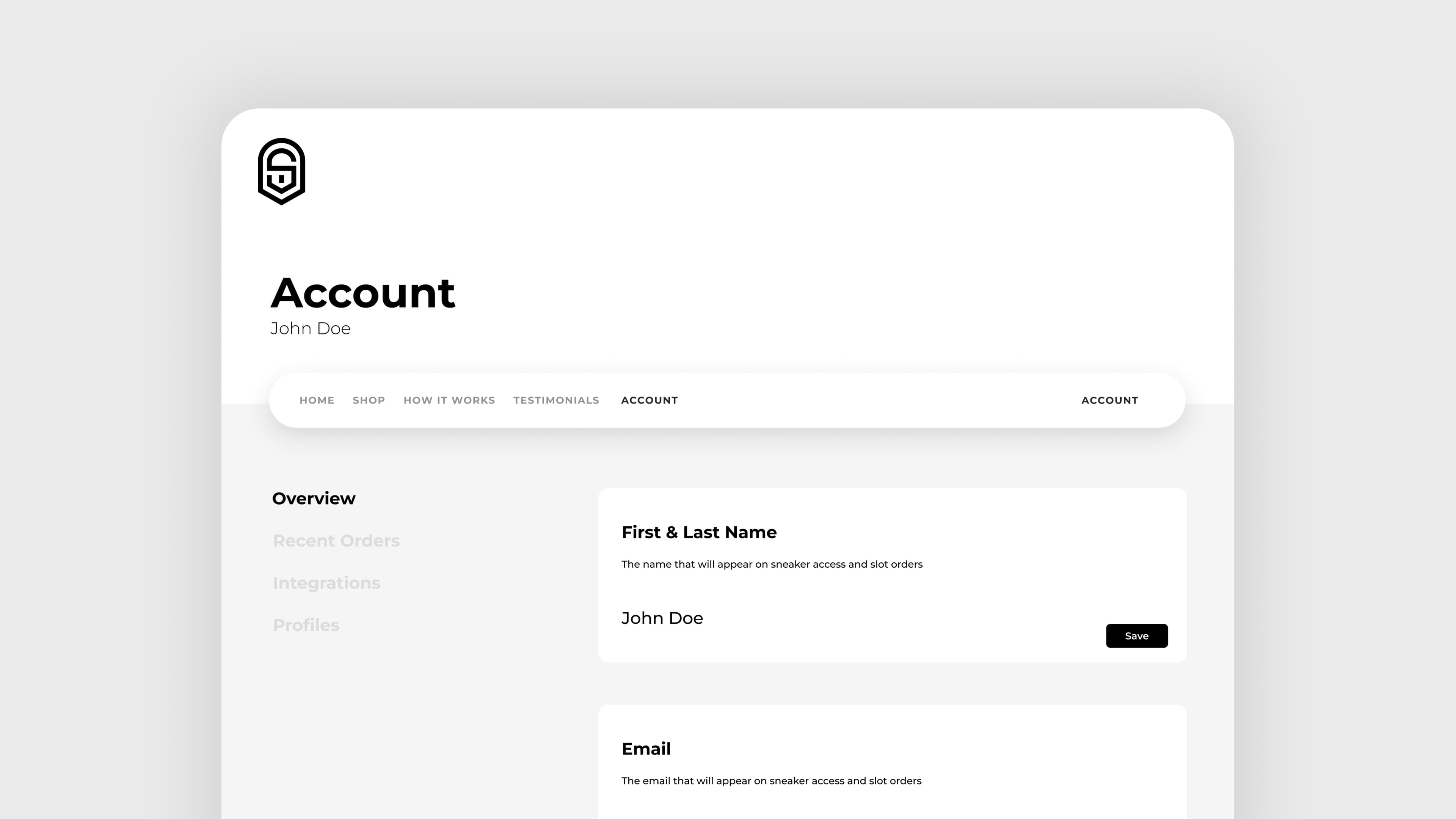
Multiple Profiles
After creating your account, cycle through the pages to purchase a slot that could potentially give you the Supreme items you've been wanting.
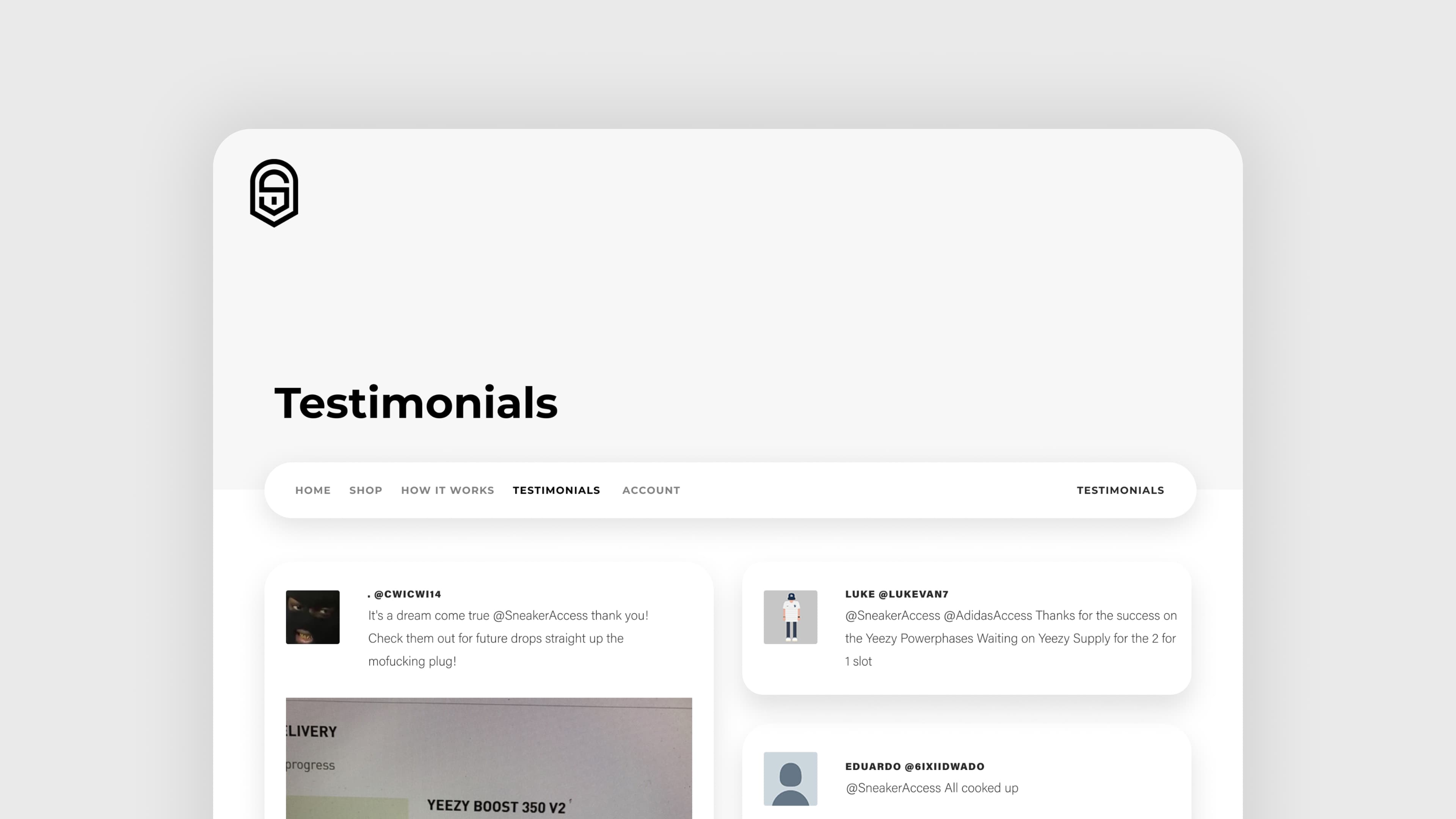
Testimonials
To bring trust to our website, we needed actual success. Users would tweet us on Twitter to confirm if our service worked for them! Having a page dedicated to testimonials brought in more customers and trust to our website.
User research
findings & results
I conducted a mixed-method study with 20 sneaker enthusiasts, including surveys and short interviews, to understand how collectors navigate drop culture.
Were unaware of sneaker bot services.
Several participants told us they had no idea this kind of intel even existed. One person laughed and said, “So this is why I can never catch a drop on SNKRS?”
Attempted to improve odds by using multiple devices.
Some collectors were investing in stacks of devices just to keep up. One participant admitted, “I figured the more laptops I owned, the better chance I had at a pair of Yeezys.”
Said they would pay for reliable drop access.
Collectors who can drop $200+ on a pair are usually heads-down at work when releases hit. They kept asking for a trusted partner who could secure drops while they stayed offline.
Prototyping the new home experience
After synthesizing user insights, I focused on simplifying the first interaction users have with Sneaker Access homepage.
Usability testing
and findings
I conducted a small usability test with twenty participants to understand clarity, completion, and comprehension across the new features. The sessions validated the flows and highlighted opportunities to simplify prompts before launch.
Before
The arrows next to "View All products" was confusing to users. Users would click the arrows thinking the next page would load.
After
Looking at the old website, I decided to take away the icons and have it highlighted. The click-through rate on our shop page increased by 100%!
Before
Users found it difficult to navigate and understand the interface layout. The previous design lacked clear visual hierarchy.
After
The redesigned interface improved user comprehension and navigation. User satisfaction scores increased significantly with the new layout.
Building a
brand identity
To support the design, I created a brand guideline kit. It includes logos, colors, images, and product vision.
The brand identity reinforces fairness and trust through clean typography, muted tones, and modern minimalism — aligning with the inclusive design philosophy behind the platform.
Building a new logo
To give the design a sense of regality, tradition, and a touch of modernity, I created a new logo.
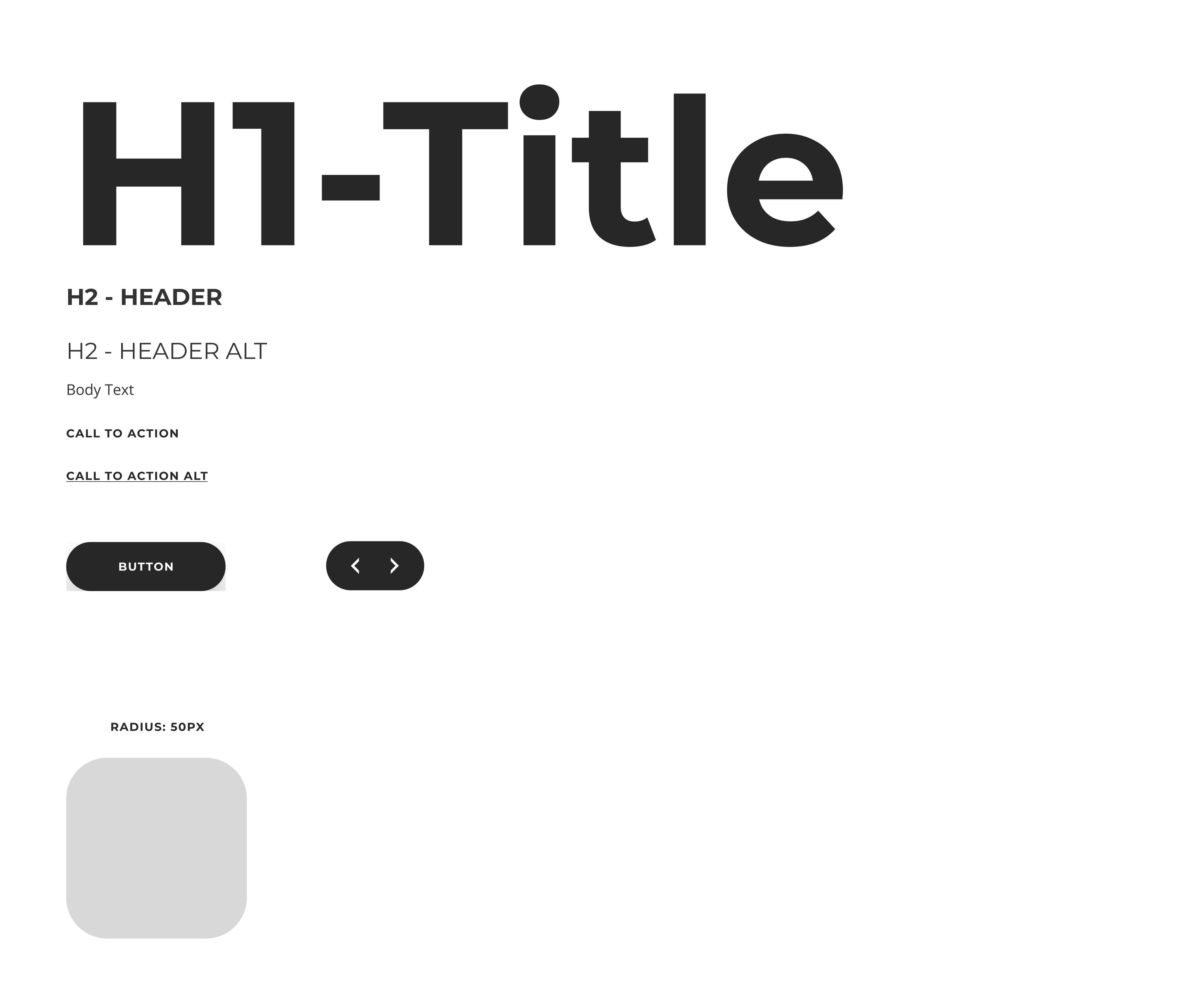
A Clean
Design System
The system included scalable components for cards, filters, and modals. It maintained accessibility compliance (WCAG AA) through tested contrast ratios and keyboard navigation patterns.
Final Outcome
Testing and simulated analytics projected a 90% improvement in conversion and a 95% reduction in abandoned carts. The process reinforced the value of designing for trust and clarity in competitive, hype-driven markets.
If I were to revisit the work, I would double down on rigorous sketch exploration and mature the design system to better guide future iterations.