Operator beside Caterpillar equipment

Basic CPM Redesign for Wheel Loader & Excavator

Caterpillar is moving its CPM payload screen onto a smaller, 10-inch portrait display that operators read in quick glances mid-load. Our first prototype swapped views as the machine worked. After testing, we cut the switch as too jarring. The final design holds every payload number still, on one layout shared by the wheel loader and the excavator.

01problem

The CPM asks for attention at the exact moment operators can’t spare it.

During active loading, payload numbers compete with secondary controls, settings, and system info on one screen. Operators interpret, do mental math, and dig through menus while running the machine. A smaller portrait display makes all of it worse.

Display
10″ portrait, replacing the separate CPM monitor
Machines
Wheel loader and excavator, one system
When
Mid-load, eyes on the bucket and the truck
Hands
Touch and dial, often in gloves, dust, and dirt

02insight

They load to the left.
The screen sits on the right.

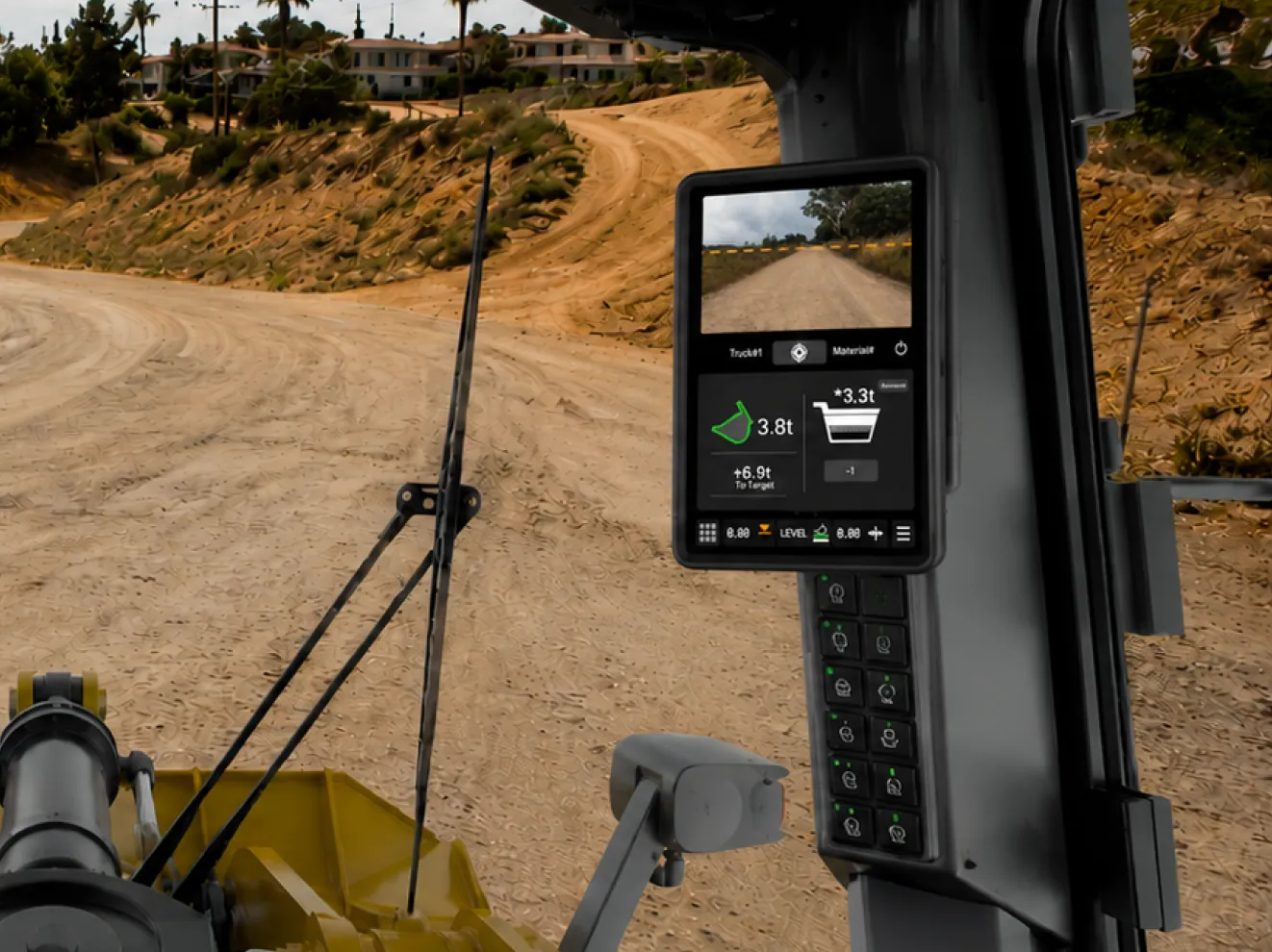
The CPM display on the right pillar of a wheel-loader cab, away from the loading work on the left
The display rides the right pillar. The work happens ahead and to the left.

Operators don’t read the CPM. They glance at it from the corner of their eye, mostly near the end of a load, to confirm the load weight.

The rule we designed to

Every screen answers one question in one look: how much is left?

how we got there

We acted out loading scenarios, sketched 12 layouts, and tested a low-fidelity prototype before any polish.

1 of 6

03decisions

Three decisions.
Each one had to survive a glance.

  1. A

    Cut the switching screen

    Progressive disclosure hides tools now, not payload.

  2. B

    Do the math for them

    The tile shows tonnes left to target, not inputs.

  3. C

    One tile, every machine

    Same payload tile, plus one slot per machine.

Decision A · Progressive disclosure

We cut the screen that changed mid-load.

After testing, we judged the swap too jarring mid-task. We kept progressive disclosure but moved it up a level. It now hides the tools, not the payload.

Before

Round one: the bed and bucket views took turns, swapping with machine state.

After

Bucket, bed, and tonnes left sit still, together. The tools wait behind Advanced.

Decision B · Glanceable hierarchy

Do the math for them.

The old flow left operators subtracting in their heads, pass after pass. The tile now shows the answer, tonnes left to target, and color appears only when the state changes.

  1. Target chip

    Pass count and state. A green crosshair means on target.

  2. Bucket weight

    What this pass is carrying.

  3. To target

    The math, done. Counts down to 0.0t and turns green.

  4. Bed weight

    The truck icon fills like a progress bar instead of sitting there as decoration.

One truck, start to finish

Four glances from one load. Each one answers the same question.

  1. 01Target set. 14.0t to go.

  2. 02First bucket: 3.3t. 10.7t left.

  3. 03Pass 4 lands it. 0.0t, in green.

  4. 04Truck full. One tap resets.

Decision C · A shared design system

One payload tile, every machine.

The wheel loader needs quick truck and material changes. The excavator needs swing position. We locked the tile to one layout and gave each machine a slot beside it. Operators described about two days of icon training, so we kept the tile consistent.

Before

One screen for both machines, a static bucket picture, no room for excavator data.

After

Amber: the shared payload tile. White: the excavator’s space for swing position.

My contribution

Built from one kit

I designed the bottom navigation and the shared design system, including its interactions. The same controls and target states carry across both machines, so operators have a consistent place to look and act.

Navigation
Explore the controls
Shared machine navigation

One navigation bar, shared by the wheel loader and excavator.

Target states
Target set target chip
Target set

The target payload is set before the first pass. The chip keeps that goal visible.

04outcome

A high-fidelity prototype for two machines, on one 10-inch screen.

What we delivered

Prototype
High-fidelity Basic CPM for the wheel loader and the excavator
Screens
Payload, advanced tools, job aids, cameras, machine gauges
System
Icons, target states, nav bar, color, and type, shared by both machines

How it landed

Mentor review
Jayce valued the bottom navigation and consistent screens. Amanda supported the direction and encouraged us to interview operators.
Operator response
Younger operators responded enthusiastically. Older operators preferred analog controls. Their responses showed where familiarity would matter as the system moved forward.
The next step
Bring the prototype into the cab and test it in the field, during real loading work.
Beyond the payload screen: machine pages built on the same frame, nav bar, and tile rules.

05reflection

Hide tools, not answers.

  1. 01

    Motion costs attention.

    Every change on screen is one more look away from the bucket. The payload stays put now.

  2. 02

    Disclosure is for tools.

    Hiding the numbers operators load to failed. Hiding the settings they rarely touch works.

  3. 03

    Every pixel carries data.

    The bed icon stopped being decoration and became the progress bar.